First of all, I have to apologize that it has taken me a while to create a new post…
Previously, we have created an overview page for the accounts that your user has. This is great, and you may want to add the next feature now, for example have his stock portfolio. However, the question then immediately arises - how will he navigate from one page to the other?
Having an easy navigation bar is crucial, as no user will want to stick with your site if he does not intuitively know how to navigate the site. Fortunately, adding new routes to your react app is a piece of cake, and you mostly need to worry about how you want the navigation bar to look. In this article, we’ll cover both of these topics.
Getting started
Before getting started though, there is one change that is needed. Google has recently updated the Material UI packages, and, unfortunately, while doing so, changed the name of their packages in a breaking change. They are no longer called material-ui, but instead mui.
To go along with this update, we will need to install the mui dependency with npm install @mui/material. After this, you need
to update your imports, such as changing import TableRow from '@material-ui/core/TableRow';
to import TableRow from "@mui/material/TableRow"; (yes, I know, this is tedious…). Other changes will be renaming justify
in your Grid to justifyContent, etc.
Next, you may want to add the following dependencies:
npm install @emotion/react and
npm install @emotion/styles.
Additionally, if you are using the makeStyles way to style your application, run npm install @mui/styles, as the import from
@mui/material will break your app.
A full guide on the upgrade can be found here.
While this upgrade is rather annoying, it will allow you to use all the new features google has introduced.
Navigation bar
Let’s start with a simple navigation bar. It will be the first item that sticks out to new users, and should therefore look great! As said, it should also be fairly intuitive to new users how to browse your site. Depending on how you want to slice your application, there are so many options available to you. I am a fan of the classical bar on the top of the page, with links containing nested dropdowns. Ideally, every component is also fairly reusable.
In order to also use the new icons, run npm i @mui/icons-material.
The first two items we’ll use are the AppBar and the ToolBar.
I will probably be creating two different NavBars - one for large screens (such as desktops) and one for small screens (such as phones).
Navigation bar look
Let’s start with the small NavBar and create a file under src/routing/SmallNavBar.jsx
import React, {useState} from "react";
import AppBar from '@mui/material/AppBar';
import Toolbar from '@mui/material/Toolbar';
import Typography from '@mui/material/Typography';
import Button from '@mui/material/Button';
import IconButton from '@mui/material/IconButton';
import MenuIcon from '@mui/icons-material/Menu';
import {AccountCircle} from "@mui/icons-material";
import makeStyles from "@mui/styles/makeStyles";

const useStyles = makeStyles({
  root: {
    borderBottomRightRadius: "10%",
    borderBottomLeftRadius: "10%",
  },
  title: {
    fontSize: 14,
  },
});

export const SmallNavBar = () => {
  const classes = useStyles();
  const [auth, setAuth] = useState(false);

  return (
    <AppBar position="sticky" className={classes.root} enableColorOnDark>
      <Toolbar>
        <IconButton
          size="large"
          edge="start"
          color="inherit"
          aria-label="menu"
          sx={{mr: 2}}
        >
          <MenuIcon/>
        </IconButton>
        <Typography variant="h6" component="div" sx={{flexGrow: 1}}>
          My Money Management
        </Typography>
        {auth ? (
            <div>
              <IconButton
                size="large"
                aria-label="account of current user"
                aria-controls="menu-appbar"
                aria-haspopup="true"
                color="inherit"
              >
                <AccountCircle/>
              </IconButton>
            </div>
          ) :
          <Button color="inherit">Login</Button>
        }
      </Toolbar>
    </AppBar>
  )
}
This is already not bad. We have the (temporary) title of the app, the Menu icon on the left, and just for laughs, already a sign whether the user is logged in or not, on the right hand side.

Coming with this setup, there is even already some small animation when you click on the Menu icon. Nothing opens yet of course, but it’s still a nice start.
Navigation menu
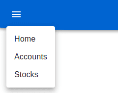
Of course, now we need to add some items to the menu. This is done by using the Menu icon as an anchor, and then popping out a menu beneath it.
Setting the anchor
  const [anchorEl, setAnchorEl] = React.useState<null | HTMLElement>(null);
  const open = Boolean(anchorEl);
  const handleClick = (event: React.MouseEvent<HTMLButtonElement>) => {
    setAnchorEl(event.currentTarget);
  };
  const handleClose = () => {
    setAnchorEl(null);
  };
Using the anchor with the first links
<IconButton
          size="large"
          edge="start"
          color="inherit"
          aria-label="menu"
          sx={{mr: 2}}
          onClick={handleClick}
        >
          <MenuIcon/>
        </IconButton>
        <Menu
          id="basic-menu"
          anchorEl={anchorEl}
          open={open}
          onClose={handleClose}
          MenuListProps={{
            'aria-labelledby': 'basic-button',
          }}
        >
          <MenuItem onClick={handleClose}>Home</MenuItem>
          <MenuItem onClick={handleClose}>Accounts</MenuItem>
          <MenuItem onClick={handleClose}>Stocks</MenuItem>
        </Menu>
This will make a menu pop out that immediately looks very familiar to users.

Adding routing
Observant readers will naturally have figured out that, while the menu items may look nice, clicking on them will not guide them anywhere, but instead just close the menu. That’s where the routing will now come in.
In order to get started with routing, I will first a couple of new pages to route to. They don’t need to be pretty, just show that everything is working as expected. Here are a HomePage and a StocksDisplay.
import React from "react";

export const StocksDisplay = () => {
  return (<div>Stocks page!</div>)
}
import React from "react";
export const HomePage = () => {
return (<div>Welcome to the home page!</div>)
}Next, there are two final actions we need to take:
- Link to the new pages on the menu items
- Define which components the SPA needs to show for each route
For both, we install react-routing-dom with npm i react-router-dom and
npm i --save-dev @types/react-router-dom.
Routing setup
Let’s first do the latter, and finally define the routing. This is done by creating the component for it, in the file
src/routing/ApplicationRouter. This component will now become the top-most component in the App.tsx, as it will contain the
full page of the app.
import Grid from "@mui/material/Grid";
import React from "react";
import {BrowserRouter as Router, Route, Switch, Redirect} from "react-router-dom";
import AccountDisplay from "../assets/accounts/AccountDisplay";
import { StocksDisplay } from "../assets/stocks/StocksDisplay";
import { HomePage } from "../general/HomePage";
import {SmallNavBar} from "./SmallNavBar";

function ApplicationRouter() {
    return (
        <Router>
            <SmallNavBar/>
        <Grid item xs={12}
    md={10}
    lg={9}
    xl={8}
    style={{margin: "auto"}}>

    <Switch>
        <Route exact path="/"> <Redirect to="/home" />
        </Route>
    {/*<Route path="/login" component={LoginPage}/>*/}
    <Route path="/accounts" component={AccountDisplay}/>
    <Route path="/stocks" component={StocksDisplay}/>
    <Route path='/home'  component={HomePage}/>
    </Switch>
    </Grid>
    </Router>
)
}

export default ApplicationRouter;
The App.tsx now looks as follows:
import Grid from '@mui/material/Grid';
import React from 'react';
import './App.css';
import AccountDisplay from "./assets/accounts/AccountDisplay";
import ApplicationRouter from './routing/ApplicationRouter';
import {SmallNavBar} from "./routing/SmallNavBar";

function App() {
  return (
    <div className="App">
      <ApplicationRouter />
    </div>
  );
}

export default App;
Immediately, when the page refreshes, we will notice that the accounts have disappeared, and replaced with our home page!
The reason that this happens is the Redirect from / to /home. This is just a personal preference, and also to show how easy
redirects are to handle. More on that later.
Something very important to notice is that the route will show the first route that matches. Therefore, you should always
start with the longer path definition, and then go down to less specific routes (e.g. /accounts/:id/details should be defined
before /accounts/:id).
Another way of enforcing the correct route is by using the keyword exact. This will then only match when the paths are exactly
the same. This may be a bit more prone to errors though.
To test this, you can remove the exact from the first route. Since every URL will contain the /, even if you type in /accounts, the application will still redirect to the home page.


Linking to routes
Okay, now the URLs already show the pages we want. Since we cannot expect the user to know all routes by heart though, we will link them to the buttons that we defined earlier in the menu.
In order to do so, change the MenuItems the following way:
          <Link to="/home" className={classes.link}><MenuItem onClick={handleClose}>Home</MenuItem></Link>
          <Link to="/accounts" className={classes.link}><MenuItem onClick={handleClose}>Accounts</MenuItem></Link>
          <Link to="/stocks" className={classes.link}><MenuItem onClick={handleClose}>Stocks</MenuItem></Link>
and the styles like so:
  link: {
    textDecoration: 'none',
    display: 'block',
    color: 'black'
  },
There we go! The menu items are now intuitive, look normal, and redirect to the wanted page. Also, you can notice that the loading of the page is much faster with these links as opposed to typing the URL in the address bar and pressing enter. The reason for this is that the showing of the components is now done through the app directly, and not by loading the full page before getting to the router.
Not found page
As a little extra, you could now also add a final page that shows the 404 error message when the user navigates to a page that does not exist. While nobody likes to see the 404 page, it may be better than to wonder why you are not receiving the content you were expecting. Adding it remains up to you, of course.
Adding the route to the 404 page is straightforward (but keep in mind it should always be your last route definition!!):
<Route path="*" component={NotFoundPage}/>You can of course show a simple page which simply informs the user that the page he navigated to does not exist and ask him to go back to the home page, but that’s just so lame! Now is your chance to be creative!
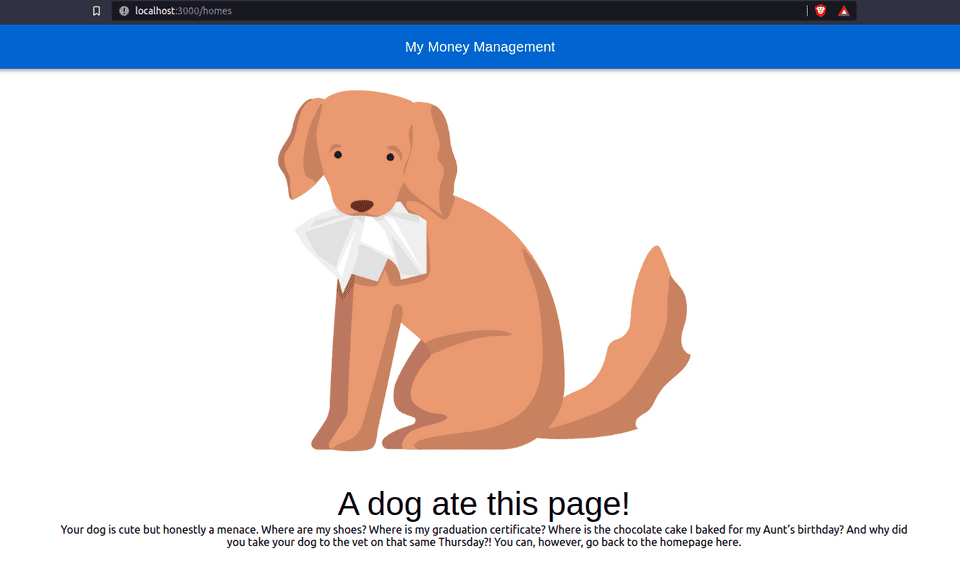
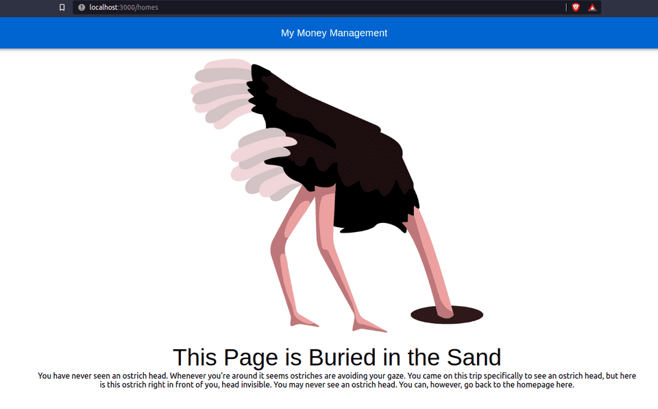
Here is what I went with, to keep the entire fact playful, but pretty also.
import React from "react";
import ostrich from './../static/images/notfound/ostrich.png';
import {NotFoundItem} from "./NotFoundItem";
import dog from './../static/images/notfound/dog.png';
import map from './../static/images/notfound/map.png';
import ghost from './../static/images/notfound/ghost.png';


export const NotFoundPage = () => {

  const key = Math.floor(Math.random() * 4);

  return (

    <div>
      {key === 0 && <NotFoundItem image={ostrich}
                                  title={'This Page is Buried in the Sand'}
                                  text={'You have never seen an ostrich head. Whenever you’re around it seems ostriches are avoiding your gaze. You came on ' +
                                  'this trip specifically to see an ostrich head, but here is this ostrich right in front of you, head invisible. You may never see an ostrich head. '}/>}
      {key === 1 && <NotFoundItem image={dog}
                                  title={'A dog ate this page!'}
                                  text={'Your dog is cute but honestly a menace. Where are my shoes? Where is my graduation certificate? Where is the chocolate cake I baked for my Aunt’s birthday? ' +
                                  'And why did you take your dog to the vet on that same Thursday?!'}/>}
      {key === 2 && <NotFoundItem image={ghost}
                                  title={'This Page is a Ghost'}
                                  text={'Once alive and now dead, this ghost appears to have some unfinished business. Could it be with you? Or the treasure hidden under the floorboards ' +
                                  'of the old mansion in the hills that may never reach its rightful owner, a compassionate school teacher in Brooklyn.'}/>}
      {key === 3 && <NotFoundItem image={map}
                                  title={'This Page is Not on the Map'}
                                  text={'You told your friends you weren’t bringing your phone, to try and experience what travel was like back in the day. You bought a map and a bottle of water and carried your camera' +
                                  ' for the money shot. But the map was from 2005 and the landscape had changed. So here you are, in the middle of a large field, ' +
                                  'that the map continues to claim is a local grocer.'}/>}
    </div>
  )
}
import Typography from "@mui/material/Typography";
import {makeStyles} from "@mui/styles";
import React from "react";
import {Link} from "react-router-dom";
type Props = {
image: any,
title: string,
text: string
}
const useStyles = makeStyles({
link: {
textDecoration: 'none',
display: 'block',
color: 'black'
},
});
export const NotFoundItem = ({image, title, text}: Props) => {
const classes = useStyles();
return (
<div>
<div>
<img style={{maxHeight: "600px", maxWidth: "60%"}} src={image} alt={"Image for not found page"}/>
</div>
<div>
<Typography variant="h3" component="div" sx={{flexGrow: 1}}>
{title}
</Typography>
</div>
{<Link to="/home" className={classes.link}>{text} You can, however, go back to the homepage here.</Link>}
</div>
)
}

This will make a pretty, and hopefully funny page for something usually unpleasant. If you have any better ideas, please do let me know in the comments!